weekly retro #90: shouts out to joan
this year i'm hosting friendsgiving and for the first time in years i managed to order a tofurkey roast in time. i spent $39 for it to be shipped in a cold pack quickly. the night it is supposed to be delivered i get a call from a man in a high rise a mile away from me. he says my boxes was delivered to him and that he'd leave it at the front desk for me to get. it was dusk, i was not walking a mile to a strange building, this was bullshit. i paid $39. i call and the concierge, joan, picks up. in her raspy voice she tells me the story like she's summarizing her favorite mystery novel to me. "why would someone send me vegan things" she said the man had exclaimed to her. i told her i'd be there first thing in the morning to pick up the package, and then first thing in the morning i made the mile long trek before any coffee to get my box. it's not recently been a safe area i was walking through, and i knew i wasn't built at that moment to be robbed at gunpoint over a box of fake fucking meats so i took a $12 (with tip) car back. the meats were still frozen, and they rest now in my freezer as ups emails me every day saying my package is still on the way and they are actively working to get me a new delivery date. every day is a winding road, welcome to my 90th weekly retro.
i can't believe i walked a mile across a major highway and still paid over $50 for getting a fake turkey roast into my freezer. this tofurkey roast better change my fucking life.
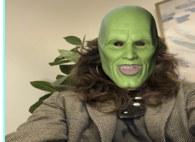
a couple of highlights this week was getting a much-needed haircut, seeing the new elizabeth holmes film and having dinner with phil, and working on my weird web october apps. i'm halfway through my game dev class and we're finally working on visual stuff and again and not just text-based. i keep procrastinating on homework until the night before lol some things truly never change!
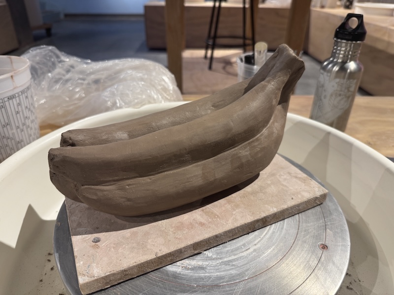
i'm just about done carving my banana bunch sculpture. they are so long lol it's comical, but the piece is supposed to be funny. maybe i should have made the bananas even longer, but i also am not trying to take up the entire community kiln up with my bullshit.
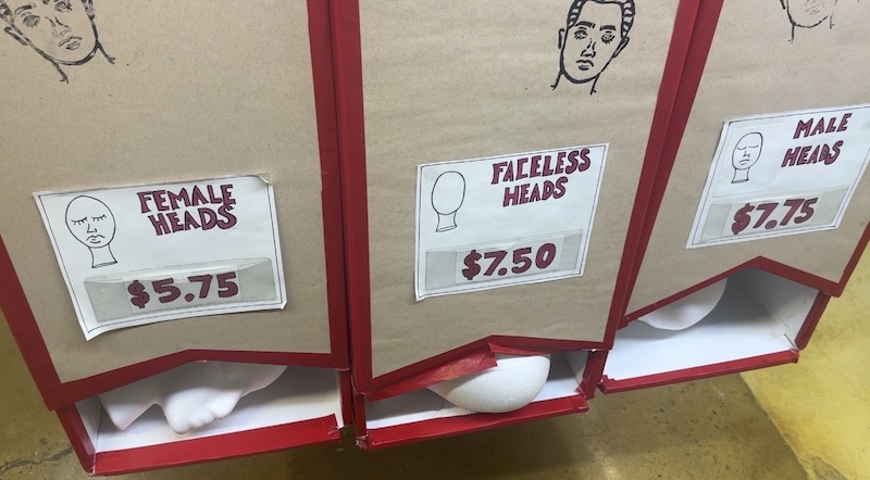
the weather has been so nice and chill that i've been walking around a lot, not just for retrieving extremely poorly delivered deliveries. somehow i managed to not lift a single weight this week, which isn't good, but i want to enjoy walking outside in this weather while i can before it becomes too cold. sometimes you gotta let the weights wait.
things i enjoyed this week
- andy and i enjoyed watching this guy who traveled 1300 miles in a huge jet ski to alaska. his attitude was great and the scenery was amazing.
- 1 hour of silence interrupted by random cupcakke sounds
- rearranging our living room, probably because it's a puzzle to do and doing puzzles with andy is one of my favorite things. also, my books are now more visible to guests and even myself.
- i took a break from writing this to quickly finish reading tim curry's memoir which i preordered but when it came out it was only a month since my father's heart attack and strokes so i didn't feel up to reading it. it really felt like he was chatting with and revisiting all his wonderful works with me.
ok it's very important that i actually do my games class homework and get a good nights rest so i don't feel like a piece of shit tomorrow, no small feat as i'm on my period and it's already 8:30pm. i absolutely need to get back on the rails this week, and also figure out if there's a way to tell ups that they don't need to keep looking for that fucking box!
xoxo jenn